How to Build a Sustainable React Application? Encapsulation, Auto Code Generation, and Form Structure

Hello everyone,
I’m sure you’ve also encountered a similar situation: many software companies tend to underestimate the front-end side of things, only to face issues later.
“It’s not that big of a deal, after all, it’s just front-end work. We’ll throw it together with React and move on. We’ll hire a few front-end developers and get it done.”
Most of the time, managers with back-end backgrounds aren’t fully aware of the architectural needs of the front end. Yet, even if no one in the company has prior React experience, decisions are often made to kick off projects with React.
Typically, the process goes something like this: one person starts handling the front-end work. As deadlines get tighter, another person is added, then another… Depending on the company’s budget, the team grows, sometimes reaching 20–30 developers. However, there’s a fundamental issue with this approach:
Managers often operate under the assumption, “If we hire an experienced front-end developer, they’ll clean things up.” But these developers are constantly pushed into rushed tasks:
“Just finish this quickly. All you need to do is add a simple textbox…”

These articles aim to walk you through the steps needed to prevent your projects from reaching this point. We’ll cover everything from file structures and API integrations to dynamic form architectures and code generation processes.
This article outlines the essential principles you need to develop sustainable and well-structured projects as quickly as possible. The goal is to make your work easier, avoid conflicts as your team grows, and keep your projects organized in the long run.
If you’re wondering, “Does this also apply to React Native or Next.js?” the answer is absolutely! The essence lies in universal software development principles.
1 — How Should Your Folder Structure Be?
It’s simple: the old way of organizing files by category — putting components in one folder, hooks in another, and services elsewhere — is a thing of the past. We don’t do that anymore.
Feature Folder Structure
Now, we group folders by features, i.e., by their functionality. Everything related to a specific feature is kept together. This makes projects more organized and easier for teams to understand.
Let’s take the famous Petstore API as an example. Imagine we have a backend like that. (You can explore it on Swagger UI: petstore.swagger.io).
Here’s how the folder structure might look:
- src
-----features
-----------pet
----------------hooks
----------------components
----------------page
----------------...
-----------store
----------------hooks
----------------components
----------------...
What Does This Achieve?
Suppose you’re working on operations related to the pet object. Everything relevant is grouped under the pet folder. This minimizes dependencies for that part of the project.
The ultimate goal is this: if I delete a feature folder under features, it should hardly impact the rest of the project. Once I clean up a few registered or used references, I can move on as if that feature never existed.
You might be thinking, “How can we plan and manage dependencies like this under tight deadlines?” Don’t worry — you’ll gain that time back. I’ll explain how shortly.
But here’s the critical part: to ensure a healthy, sustainable structure and avoid conflicts as your team grows:
Every feature should be self-contained!
Taking Encapsulation a Step Further
Let’s push this concept even further. For example, say you have a PetCreationModal that opens, containing lots of actions and a complex structure. The same principle applies here.
If necessary, this modal will have its own hooks, subcomponents, context structures, and services — all encapsulated within itself, working independently.
Here’s how it might look:
- src
-----features
-----------pet
----------------components
-----------------------PetCreationModal
-------------------------------subcomponents
-------------------------------hooks
-------------------------------contexts
-------------------------------services
The same principle applies: if I delete the PetCreationModal folder, nothing related to it will remain in the project. I’ll only need to clean up a few places where it was used, and that’s it. This way, I can completely remove this component from the project without leaving a trace. It doesn’t matter if it contains hundreds of files, subcomponents, or represents hundreds of man-days of effort.
The Result?
Every component will be fully encapsulated within itself.
No more of “This part of the component is here, another part is there…” That’s not how we do it. When the folder is deleted, it will be as though it never existed.
Why Take This Approach?
- Simplified Workflows: The component will be neatly organized. Everything you need will be right in front of you, close to the file you’re working on. No more scrolling up and down the file explorer thinking, “Where was that again?”
- No Fear of Breaking Things Down: With everything organized, the component won’t turn into a 2,427-line monster. Business logic and subcomponents will be kept clean and separate.
- Increased Speed: When a bug arises related to the component, you can confidently say, “The problem is here, within this folder.” Narrowing the scope will significantly reduce the time spent troubleshooting.
- Easier Changes: One day, when your boss or client decides, “This isn’t working, we need to do it differently” (and let’s admit, those with written proof can sit quietly here 😄), deleting the component and building a new one will be child’s play.
- Cleaner Codebase: The component will handle all its business logic internally, connecting to the rest of the project with just a few properties. This keeps your codebase clean and maintainable.
I could go on and on — there’s no end to the benefits of this approach. It’s like a magic elixir for your project. And the best part? This pattern is just as applicable to the backend. Everything I’ve mentioned can be implemented in the same way.
The feature folder structure works just like an organized wardrobe. If your wardrobe is messy, with clothes scattered, wrinkled, and mixed up, finding the right outfit for an urgent occasion becomes almost impossible. Some clothes might be great but are wrinkled, requiring you to spend long minutes ironing before you can wear them again. Others might be damaged beyond use, and you wouldn’t even know it. You’re left with two options: go out wearing an ill-suited outfit or risk being late as you scramble to prepare.
But if your wardrobe is tidy, with clothes categorized and ready to wear, you can decide at a glance. Which pants go with which shirt? Which combination suits which day? All of this has already been considered in advance.
The feature folder structure offers this same kind of organization. For example, a combination is ready for meeting days: the Meeting feature. Another combination is available for picnics: the Picnic feature. And for sports? The Sports feature. Whatever you need, you can quickly grab it. Everything is prepared, compatible, and logically categorized.
This structure not only speeds up your workflow but also keeps your codebase clean and sustainable, just like a well-organized wardrobe makes your mornings easier and more efficient.

If you’d like to dive deeper into this topic, you can search for resources using the keywords “Feature folder structure.”
2 — How Should We Handle API Connections?
I’ve seen projects where front-end developers manually write API types by looking at Swagger documentation — or even by opening the back-end code to replicate the same data structures. For instance, if two objects inherit from each other on the back end, they try to replicate the same structure on the front end.
But here’s the truth: the internal data structure of the back end is irrelevant to the front end. It doesn’t — and shouldn’t — matter.
The front end’s job is simple at its core: make a request to the API, receive the response, and process it. That’s it.
Of course, there are various API types, but here we’ll focus on the commonly used REST APIs.
Let’s take a pet-store API as an example. Suppose we want to create a new pet. The endpoint for this operation might look like this:
/petWe need to send a POST request to this endpoint. But what exactly do we need to post?
Swagger or the API documentation usually provides example data. That example data shows the format the API expects. By using this format, we can send our request correctly.
{
  "id":2,
  "category": {
    "id": 0,
    "name": "string"
  },
  "name": "cattie",
  "photoUrls": [
    "string"
  ],
  "tags": [
    {
      "id": 0,
      "name": "string"
    }
  ],
  "status": "available"
}
But I’m using TypeScript. Don’t I need types? Of course, I do. And on the back end, there’s OpenAPI.
What If the Back End Has OpenAPI?
If OpenAPI is available, life gets so much easier. If it isn’t, don’t hesitate to tell the back-end developers:
“Please prepare OpenAPI documentation. How are we supposed to develop code without proper documentation?”
Why does OpenAPI make things easier? Because it provides everything we need: the API’s endpoints, data structures, and even detailed definitions. With all this information at hand, there’s no need to manually write types. We can automatically generate TypeScript types using code generators.
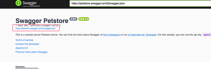
For example, if you’re given a JSON link, clicking on it will reveal all the endpoints, types, function details, requests, and responses.
So What Are You Waiting For? Generate It!
By using open-source tools, like the one on GitHub with over 21,000 stars, you can generate everything you need from the API. Let the tools do the heavy lifting for you.
OpenAPI Generator
GitHub — OpenAPITools/openapi-generator: OpenAPI Generator allows you to generate API client libraries, server stubs, documentation, and more.
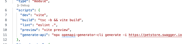
Here’s an example command I use to generate the entire API and place it under the src/generated folder:
npx openapi-generator-cli generate -i https://petstore.swagger.io/v2/swagger.json -g typescript-axios -o src/generated/apiCrazy, right?
This command generates a TypeScript client using typescript-axios. You can find more commands and options in the documentation to tailor it to your project’s needs.
Pro Tip: The first time you run it, you might encounter Java-related errors since the tool runs on Java under the hood. Simply install Java and resolve any errors, and it will work like a charm.
Why Is This So Powerful?
It saves me an incredible amount of time because I never have to manually deal with APIs, endpoints, or services. Everything is ready for me to use.
Let’s Start with an Example Project
I usually kick things off with Vite, but you can use any framework you prefer. Whether it’s React Native, Next.js, or Create React App, it doesn’t matter.
yarn create vite my-sustainable-app - template react-tsTypeScript is absolutely crucial, in my opinion. It’s not just for large, organized projects — it’s a must-have even for small ones.
Anyway, let’s move forward. First, I install OpenAPI Generator and add a new script to the package.json file.
Step 1: Install OpenAPI Generator
Run the following command to install the OpenAPI Generator CLI as a development dependency:
yarn add @openapitools/openapi-generator-cliStep 2: Add a Script in package.json
Add a script to your package.json to generate the API client. For example:
"scripts": {
  "generate:api": "openapi-generator-cli generate -i https://petstore.swagger.io/v2/swagger.json -g typescript-axios -o src/generated/api"
} 
Step 3: Run the Script
Now, you can run the command to generate your API client:
yarn generate-apiWhy This Matters
By adding this script, you’ve automated a key part of your workflow. You can regenerate your API client anytime, ensuring it stays in sync with your back-end definitions. With TypeScript types generated alongside the client, your front-end development becomes safer, faster, and more reliable.
This setup will make your project scalable and easy to maintain, no matter its size.
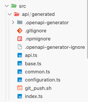
Once you run the OpenAPI Generator, you should get a folder structure with generated files. These files will include APIs and TypeScript types based on your Swagger schema. Everything is set up and ready to use.
Explore api.ts
If you open api.ts, you’ll see that it contains everything you need. The APIs you’ll use are derived from a BaseAPI class.
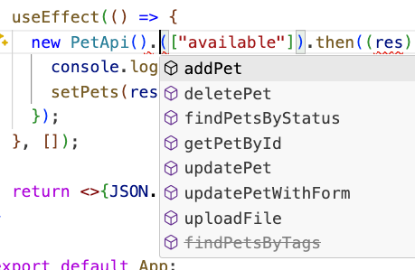
For example, in the generated files, you might see something like this:

Here, PetApi, StoreApi, and other APIs are already specialized for Axios (since the command you used was configured for typescript-axios). If you prefer another HTTP client, you can find options in the documentation and customize your generation command accordingly.
Install Axios
Since these APIs are tailored for Axios, we’ll need to install Axios to use them:
yarn add axiosStart Using the API
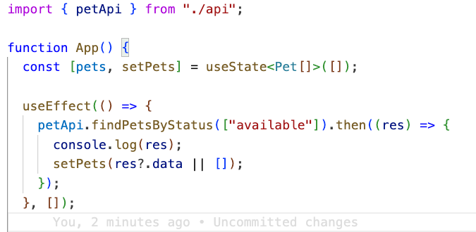
Now, you can start using your generated API in your project. For example, in App.tsx:
Why This Is Powerful
- Ready-to-use APIs and Types: All endpoints, request/response structures, and type definitions are pre-generated.
- Axios Integration: APIs are specifically customized for Axios, ensuring consistency and ease of use.
- Instant Productivity: With just a few steps, you’re set up to interact with your back end in a fully type-safe manner.
This approach not only speeds up development but also minimizes errors and ensures maintainability, even as your project grows.
And here it is: all the generated endpoints are listed, and the Pet object is created with every field I might need. Can you imagine how much time this saves the team?
Sure, this is a small project, but the larger the project, the more time it saves. Why? Because we’re generating all the API connection code upfront. Even if there are 1,000 APIs, we don’t care.
- How should I group endpoints?
- Do I need to code the types?
- What data comes from that endpoint?
- Did the endpoint change?
I don’t care!
Just generate it and use it.
To make this setup even cleaner, let’s create an index.ts file under src/api.
// src/api/index.ts

import axios from "axios";
import { Configuration, PetApi, StoreApi, UserApi } from "./generated";


const axiosInstance = axios.create({});
axiosInstance.interceptors.request.use((config) => {
  // get tokens etc...
  config.headers["Authorization"] = "";
  return config;
});
const configuration = new Configuration();

const petApi = new PetApi(configuration, undefined, axiosInstance);
const storeApi = new StoreApi(configuration, undefined, axiosInstance);
const userApi = new UserApi(configuration, undefined, axiosInstance);

export { petApi, storeApi, userApi };

export * from "./generated"; // exporting all generated types
At this point, you can customize your Axios instance, such as adding interceptors for tokens or other configurations. Ideally, you should move the Axios instance to a separate file for better maintainability. For now, let’s keep it simple, but this is something you’ll want to refactor later.
Instead of creating a new API instance in App.tsx, you’ll directly import and use petApi from your centralized API setup.
Step 1: Create a Custom Axios Instance
Let’s create a file src/api/axiosInstance.ts to define and export your customized Axios instance:
// src/api/axiosInstance.ts
import axios from 'axios';

const axiosInstance = axios.create({
  baseURL: 'https://petstore.swagger.io/v2',
  timeout: 10000,
});

axiosInstance.interceptors.request.use(
  (config) => {
    const token = localStorage.getItem('authToken'); // Example token
    if (token) {
      config.headers.Authorization = `Bearer ${token}`;
    }
    return config;
  },
  (error) => Promise.reject(error)
);

export default axiosInstance;
Now, instead of creating a new API instance in App.tsx, simply import the petApi:
If your backend consists of microservices, and you need to connect to multiple web APIs, it makes perfect sense to have separate Axios instances and generated clients for each API. For example, if you have pet, store, and user APIs, here’s how you can structure and handle them systematically.
Structure for Multiple APIs
src/
  api/
    pet/
      generated/
      index.ts
    store/
      generated/
      index.ts
    user/
      generated/
      index.ts
Step 1: Generate APIs Separately
For each API, use a separate OpenAPI Generator command to generate the client:
npx openapi-generator-cli generate -i https://petstore.swagger.io/v2/swagger.json -g typescript-axios -o src/api/pet/generated
npx openapi-generator-cli generate -i https://storeapi.example.com/swagger.json -g typescript-axios -o src/api/store/generated
npx openapi-generator-cli generate -i https://userapi.example.com/swagger.json -g typescript-axios -o src/api/user/generated
A Proper Fetch Operation
Let’s take another look at the code. Suppose after fetching data, you need to perform complex operations, or before making a POST request, you have a lot of business logic to handle.
Is it reasonable to fetch the data directly in useEffect and then set it into a useState?
Absolutely not.
To be honest, this is one of the worst things you can do. I’ve seen projects where a single screen had over 30 useState hooks and 15 useEffect hooks. Working with such code can turn into a nightmare.
Why Is This a Bad Practice?
- State Explosion: Overusing
useStateresults in fragmented and unmanageable state logic. - Side Effect Hell: Multiple
useEffecthooks can lead to unpredictable behaviors, especially when dependencies aren’t handled correctly. - Difficult Debugging: When the logic is scattered across multiple hooks, tracing issues becomes a daunting task.
- Poor Scalability: As the component grows, the code becomes harder to maintain and extend.
State Management: The Most Critical Topic in React
State is one of the most important and delicate topics in React. Why? Because every time a state changes, the page re-renders. What does this mean?
It means all states need to work harmoniously together. Otherwise, you’ll encounter re-rendering issues and spend endless hours fixing bugs that arise from states being out of sync.
What Does “State Harmony” Mean?
Let’s say I want to show a loading animation on the screen. What will I do? I’ll quickly add a new state: loading.
- When the fetch operation starts, I’ll set
loadingtotrue. - When the fetch completes, I’ll set
loadingtofalseand also assign the data to its respective state.
This sounds simple enough. But it doesn’t stop here:
- Is it just
loading? What about anerrorstate? - Then you might need pagination or even infinite scroll.
- You might need to cache the fetched data — or sometimes, clear the cache.
There’s no end to the things you need to handle.
When you do all this manually, you end up with a laundry list of steps to remember. And if you forget even one step… that’s when the bugs creep in.
The Cycle of Debugging Chaos
You open the screen, and it doesn’t work. “What’s going on? Why isn’t this working?” You dive back into the code, hunting for the missing step. A few minutes later, you find it and think, “Really? That was it?”
Then you start berating yourself:
“How could I forget this? What an idiot!”
The real problem is that if a task requires multiple sequential steps, you need to group them together. By grouping these steps, you make it nearly impossible to forget one. Forget about forgetting — you won’t even need to remember the steps anymore.
There’s a library that handles all of this for you. It’s tested, reliable, and absolutely brilliant.
And of course, we’re going to use it.
REACT-QUERY
https://tanstack.com/query/latest/docs/framework/react/overview
React Query works seamlessly with many front-end frameworks. At its core, we use a hook for each fetch operation. Here’s how to set it up in your project.
Step 1: Install React Query
Add React Query to your project using Yarn:
yarn add @tanstack/react-queryStep 2: Register QueryClientProvider
You need to register the QueryClientProvider at your app's entry point. For example, if your entry point is main.tsx, follow these steps:
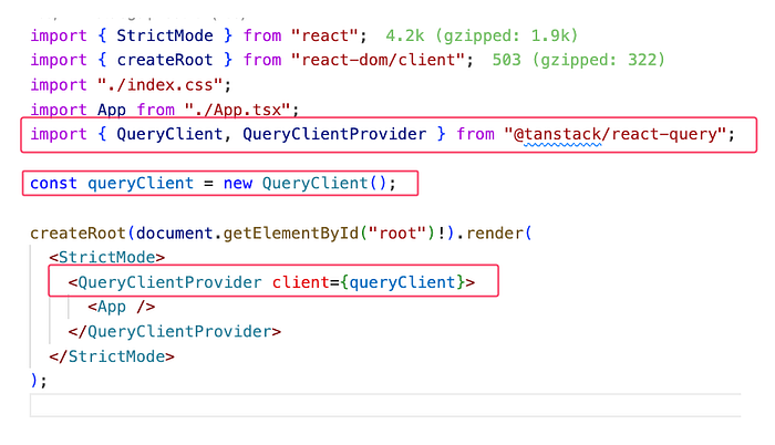
and use it
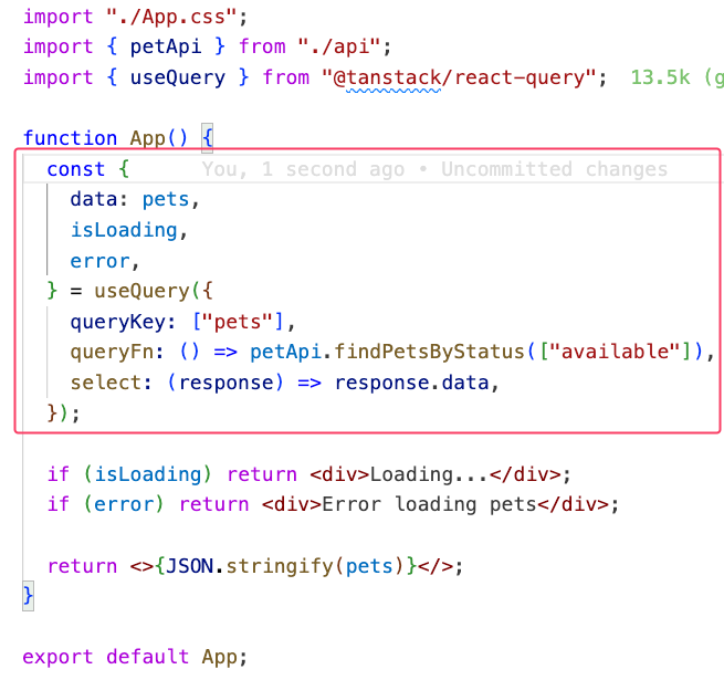
Now, I no longer need to deal with useEffect or manually manage states for fetching data. All the states I previously created for loading, error handling, and data are now delegated to React Query.
React Query takes care of managing all relevant states for me. I don’t have to worry about:
- Forgetting a Step: Every part of the data-fetching lifecycle (loading, error, success) is handled automatically.
- State Misalignment: No more mismatched or conflicting states — React Query ensures everything stays in sync.
- Potential Bugs: By delegating state management to a proven library, the chances of introducing state-related bugs drop to nearly zero.
What This Means for Development
- Simpler Code: Components are now focused purely on rendering, without the complexity of handling fetch logic or state synchronization.
- Error-Resilient: Common mistakes, such as forgetting to update
loadingorerrorstates, are completely avoided. - Maintainability: The clean separation of concerns makes the codebase easier to maintain and scale.
Organizing Queries
Now that we’ve covered React Query and its benefits, let’s implement the feature-based folder structure I mentioned earlier. This involves separating layers for better modularity and maintainability, especially as the project grows.
Setting Up Aliases for Cleaner Imports
To ensure that your imports remain organized and clean, the first step is to set up an alias in your tsconfig.json. This makes it easier to reference different layers in your project without relative paths like ../../../

(If you’re using Vite, you’ll also need to update the vite.config.ts to ensure the aliases work during development and builds:)
// src/features/pet/api/useFindPetsByStatusQuery.ts
import { useQuery } from "@tanstack/react-query";
import { petApi, FindPetsByStatusStatusEnum } from "@/api";
export type UseFindPetsByStatusQueryParams = {
status?: FindPetsByStatusStatusEnum[];
};
export const useFindPetsByStatusQuery = ({
status = [FindPetsByStatusStatusEnum.Available],
}: UseFindPetsByStatusQueryParams) => {
return useQuery({
queryKey: ["pets", status],
queryFn: () => petApi.findPetsByStatus(status),
select: (response) => response?.data, // data transformation here
enabled: status.length > 0, // fetch on a case
staleTime: 1000 * 60 * 5, // 5 minutes cache
});
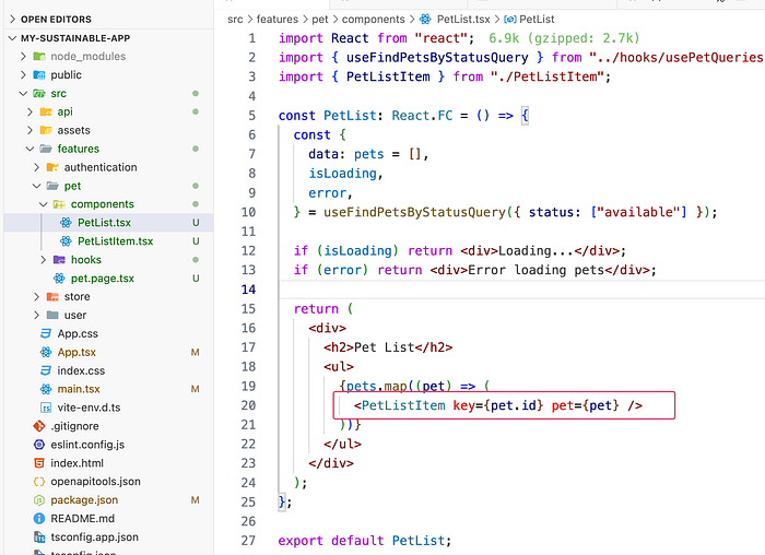
};Once the aliases and folder structure are set up, you can easily import and use the organized queries, APIs, and components anywhere in your project. Let’s look at an example using the PetList component.
import React from "react";

import { Pet } from "@/api";
import { useFindPetsByStatusQuery } from "@/features/pet/api";

const PetList: React.FC = () => {
  const {
    data: pets = [],
    isLoading,
    error,
  } = useFindPetsByStatusQuery({ status: ["available"] });

  if (isLoading) return <div>Loading...</div>;
  if (error) return <div>Error loading pets</div>;

  return (
    <div>
      <h2>Pet List</h2>
      <ul>
        {pets.map((pet) => (
          <li key={pet.id}>
            {pet.name} - {pet.category?.name}
          </li>
        ))}
      </ul>
    </div>
  );
};
export default PetList;
Absolutely! It’s great that you’re keeping the complexity encapsulated within the feature itself. But you’re right — rendering inline JSX inside a .map() function is a common mistake to avoid. It can lead to messy code, hinder readability, and make the component harder to maintain.
Why Avoid Inline Rendering in .map()?
- Readability: Inline code in
.map()can quickly become hard to read, especially as the logic grows. - Maintainability: Separating concerns allows for easier debugging and future updates.
- Reusability: By extracting the code into a separate component, you can reuse it elsewhere if needed.
Correct approach:
If PetListItem is not shared across the project and is only used inside PetList, then you’re absolutely correct—the same encapsulation principle applies here. In this case, you should group PetListItem directly within the PetList component to keep the feature self-contained and maintainable.
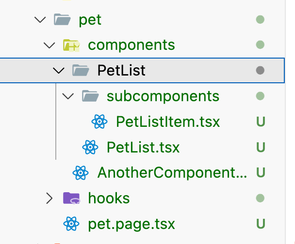
If necessary, this PetList can have its own hooks, context, or even its own router.
The goal here is to increase depth rather than the number of files horizontally. The idea is to go deeper when needed. However, when looking at it on the surface, we should be able to see which components we have without any confusion.
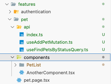
For example, when I look at the pet feature, I should clearly see which components are available.

If `PetListItem` were here as well, it could cause confusion because it’s actually just a part of `PetList`. If I wanted to delete the `PetList` component, I would also need to search for and delete `PetListItem` separately. For a complex component with dozens of subcomponents, this becomes impractical. As a result, deleting a complex component would leave a lot of leftover artifacts.
However, just because `PetList` is in its own folder doesn’t mean every component needs to have its own folder. When I look at it, I can infer that `AnotherComponent` is just a simple `.tsx` file, so it’s not that complex. On the other hand, if `PetList` is in its own folder, I can deduce that it has its own internal complexity.
I can further detail the structure of `PetList` as follows:
import { Pet } from "@/api";

export const PetListItem = ({ pet }: { pet: Pet }) => {
  return (
    <li key={pet.id}>
      {pet.name} - {pet.category?.name}
    </li>
  );
};
I’m separating this part because its complexity might increase significantly in the future. Buttons could be added — add, delete, update buttons, or even a “add to cart” button. Hover effects could be introduced — anything is possible. Handling all of this directly within the loop of the parent component would be far from practical, both in terms of performance and maintainability.
So, here’s the rule:
Never render anything directly inside a loop! Even if it’s a tiny component, always separate it as a sub-component.
With this structure, my “Pet Page” will remain clean and easy to understand.
In this case, your App.tsx will look something like this:
import "./App.css";
import PetPage from "@/features/pet/pet.page";

function App() {
  return (
    <>
      <PetPage />
    </>
  );
}
export default App;
The Role of Page and Screen Components
Page or Screen components should act as a kind of navigation guide for developers. These components should have no complexity and serve a simple purpose:
- Render the Required Components: They should only render the necessary components for the page.
- Handle Basic Settings: Such as setting the document title or initializing minimal page-specific configurations.
Beyond this, they should contain no additional logic and remain clean and straightforward.
Example: Medium Home Page Code
Here’s an example of what a Page component for Medium's homepage might look like:
const MediumHomePage = () => {
  return (
    <>
      <Header />
      <PostList />
      <Footer />
    </>
  );
};
Veya Apple’ın anasayfasını düşünelim:
export const AppleMainPage = () => {
    return <>
      <LocationChooser />
      <HeaderMenu />
      <Hero type='Macbook Pro' />
      <Hero type='Mac Mini' />
      <Hero type='iMac' />
      <Collections items=['iPhone16Pro',
                          'iPhone16',
                          'watch',
                          'appleIntelligence'] />
      <AdvCarousel />
      <Footer/>
    </>
}
That’s all there is to it! Managing this page should be as simple as “add this component, remove that component.” Every component should encapsulate its own complexity.
A component might include other components, or even be the most complex component you’ve ever seen. But that complexity should never leak out. Every component should essentially say:
“Hey, handle your mess elsewhere, don’t drag us into it.”
This is the essence of encapsulation.
Think of a Component Like Car Parts
You can think of each component as part of a car. To drive a car, all you need are the steering wheel, the gas pedal, and the brake pedal. These are the properties of the component. They allow you to interact with the car without worrying about its internal complexity.
The engine, transmission, axles — most people who drive cars have never even heard of these terms, let alone know how they work. Why? Because these systems don’t expose their complexity to the user. The entire purpose is to provide a seamless driving experience with only the steering wheel, gas pedal, and brake pedal working perfectly. The internal complexity is encapsulated.
In the automotive industry, this principle has been followed for over a century. There are specialized experts for every part: engine mechanics, transmission experts, bodywork specialists… If all these systems were intertwined and messy, no one could repair a car when it broke down. Worse yet, if that complexity were visible to the user, no one would know how to drive a car.
Imagine if this structure didn’t exist. We might still be traveling with ox carts today.

3- How Should Forms Be Structured?
If we were to rank the most complex components in React projects, forms would undoubtedly top the list. Thankfully, we have excellent libraries to manage this complexity: Formik, React Hook Form, or the built-in form solutions provided by your component library (e.g., Ant Design Forms).
We’re not going to debate which library is better — they’re all great and usable. However, to create a maintainable form structure, there are a few critical points to consider.
Separation of Concerns (SoC)
This is the foundational principle that distinguishes high-quality projects from subpar ones. When building forms, applying this principle is a must.
The Classic Problem
In a traditional setup, the following steps are often done simultaneously when creating a form:
- Defining the states for the form.
- Adding form fields inside the form.
- Styling the form to match the design.
- Assigning properties to the fields.
The result? Scattered focus!
For example, when adding a dropdown field, you might find yourself both configuring its properties and tweaking the CSS for the div that wraps it. Often, this dropdown's configuration has already been used in another form.
So you think, “Let me copy it from there,” and end up searching through the entire project, copy-pasting, and hoping for the best.
“All I want is to add a dropdown to this form — why is it so hard?!”
What’s worse, this process has likely been repeated dozens of times before.
Now imagine you’re adding a new form field that’s being used for the first time in the project — say, a date range picker or a data transfer picker. Things get even more complicated. You wrestle to integrate this new field into the form, and your focus is completely derailed.
Is There a Better Way?
Of course, there is!
Managing Forms the Right Way: Breaking Down the Complexity
We can eliminate the chaos in form management by using the right methods. The focus is clear: separate the parts distinctly and make every step simple and reusable.
In the next step, I’ll explain this simple method.
Separation of Concerns: Breaking Down the Responsibilities
When building forms, what are our concerns? Let’s break them down:
1. Field Definition
- What fields will the form include?
- What are the data types of these fields?
- Under what conditions will a field be valid or invalid?
2. Field Population and Props
- What properties will each field have?
- When should they be
disabledorenabled? - If it’s a dropdown, how will the
optionsbe populated?
3. Field Placement
- Where and how should the fields be placed in the design?
- How should they align to match the UI/UX requirements?
Separation of Concerns: From Macro to Micro
The Separation of Concerns (SoC) principle is often understood on a macro level. For example:
- Separating backend and frontend layers,
- Separating the logging structure,
- Separating the caching system.
However, this principle should also be embraced and applied on a micro level. In fact, even when adding a single <div>, this principle should guide your approach.
Helper Libraries
To simplify our work and implement the Separation of Concerns principle effectively, we’ll leverage a few libraries. These libraries exist to minimize complexity and make forms more maintainable.
react-ts-form: Mapping Form Fields with Zod
react-ts-form is a small yet powerful library that helps map form fields based on schemas defined with Zod. It simplifies schema-based form field creation, making the process straightforward and less error-prone.
We’ll use this library for now. Its functionality is simple but effective: it allows you to generate form fields directly from Zod schemas.
Why Use react-ts-form?
- Schema-Driven Forms: Build forms directly from a Zod schema, ensuring consistency between your validation and form structure.
- Reduced Boilerplate: Avoid manually mapping fields to validation logic, saving time and reducing the risk of errors.
- Type-Safe: Since both Zod and
react-ts-formare TypeScript-friendly, your form fields will have end-to-end type safety.
yarn add @ts-react/form zod react-hook-form @hookform/resolversBasic Infrastructure and Field Example
In this step, we’ll focus on building a basic form infrastructure using pure HTML and CSS, without worrying about design aesthetics. The goal is to set up a foundational form structure and implement 1–2 fields. With this pattern, you can easily integrate any component library in the future.
CSS Adjustments for Clean Layout
To make the form and the page look a bit more organized, add the following styles to your application’s CSS file:
/* App.css */

body {
  padding: 20px;
  font-family: "arial";
  color: #555;
  font-size: 14px;
}

form {
  display: flex;
  flex-direction: column;
  gap: 10px;
  width: 400px;
}

.form-item {
  display: flex;
  flex-direction: column;
  gap: 2px;
}

.error {
  color: red;
  font-size: 0.8em;
}

input {
  padding: 10px;
  border: none;
  border: 1px solid #aaa;
  border-radius: 8px;
}

button {
  padding: 10px;
  border: none;
  border-radius: 8px;
  background-color: #007bff;
  color: white;
  cursor: pointer;
}
Infrastructure and Form Schema Setup
To organize the foundational structure of the project, create two directories under src:
infrastructure: For core infrastructure elements that will be shared across the project.SchemaForm: This will serve as a standalone form framework. It’s kept separate from other components because it establishes an independent form of infrastructure.
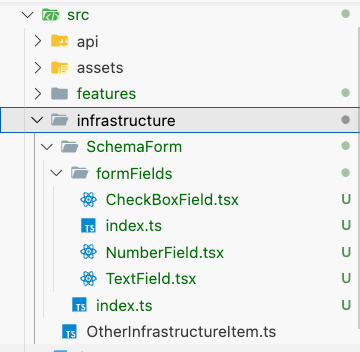
Starting with the Quick Start example from the ts-react-form documentation and adapting it to your project is an efficient way to get things running. Here’s how you can adjust it for your use case.
// /src/infrastructure/SchemaForm/index.ts

import { createTsForm } from "@ts-react/form";
import { z } from "zod";
import { CheckBoxField, NumberField, TextField } from "./formFields";

// create the mapping
const mapping = [
  [z.string(), TextField],
  [z.boolean(), CheckBoxField],
  [z.number(), NumberField],
] as const; // 👈 `as const` is necessary

// A typesafe React component
const SchemaForm = createTsForm(mapping);

export default SchemaForm;
Mapping Form Fields with ts-react-form
As you can see, ts-react-form serves as a mapping library. The schema defines the type of a field, and we map that type to a corresponding form field:
Stringtype →TextFieldBooleantype →CheckboxFieldNumbertype →NumberField
This library makes these mappings effortless, but it’s worth noting that other libraries can be used, or you could even build this structure from scratch. The key is to use form fields systematically.
Goals for Form Design
- Avoid Moving Large Code Blocks: Keep the code modular and reusable.
- Simplify Property Management: Use clean, minimal configurations to avoid unnecessary complexity.
- Separate Concerns: Clearly distinguish between the three steps:
- Field Definition: What fields exist and their types.
- Field Population: How fields are populated with values or options.
- Field Placement: Where fields are rendered within the form.
By following this approach, forms become more readable and maintainable, and adding or modifying forms becomes much easier.
Field Definitions and Basic Logic
Let’s start by defining the fields.
Step 1: Define the Schema
Create a Zod schema to define the form’s fields and their validation logic.
TextField
// /src/infrastructure/SchemaForm/formFields/TextField.tsx

import { useFieldInfo, useTsController } from "@ts-react/form";

type TextFieldProps = {
  className?: string;
  testId?: string;
  type?: "text" | "password" | "email";
};

export function TextField(props: TextFieldProps) {
  const { field, error } = useTsController<string>();
  const { label, placeholder } = useFieldInfo();

  return (
    <div className="form-item">
      <label>{label}</label>

      <input
        onChange={(e) => field.onChange(e.target.value)}
        value={field.value ? field.value : ""}
        placeholder={placeholder}f
        {...props}
      />

      {error && <span className="error"> {error.errorMessage}</span>}
    </div>
  );
}
useTsController and useFieldInfo Hooks
When building form fields, these two hooks are essential for keeping things clean and manageable:
1. useTsController Hook
The useTsController hook provides essential functionality for managing the field’s state and behavior:
field.value: The current value of the field.onChangeevent: A handler for updating the field’s value.error: Any validation errors associated with the field.
2. useFieldInfo Hook
The useFieldInfo hook focuses on user-facing attributes, such as:
label: The label text for the field.placeholder: Placeholder text for guiding the user.
Unified Pattern for All Fields
These hooks allow you to build fields in a clean and consistent way, no matter how complex they are. Even for highly advanced fields, such as:
- A field pulling data from a data table.
- A field performing complex calculations internally.
The core principle remains the same:
- Input: The value entered or selected by the user.
- Output: The value updated in the submitted object.
The only thing to watch out for is ensuring the field’s value type is properly defined.
useTsController<string>();Supporting Different Field Value Types
You can replace string with any type of value that your form field needs to support:
- Objects: Complex objects like user profiles or configuration settings.
- Arrays: Lists of values such as tags, skills, or selected items.
- More Complex Structures: Nested or custom data structures, such as date ranges or data tables.
The Goal
The goal is to ensure that form fields remain independent and reusable. Each field should encapsulate its behavior and logic, making it easy to integrate them into different forms. This independence means:
- Reusability: Use the same field in multiple forms without modification.
- Scalability: Easily add new fields to your forms as your project grows.
- Maintainability: Manage each field’s complexity within its own scope, avoiding unnecessary dependencies.
NumberField and Checkbox Field
import { useFieldInfo, useTsController } from "@ts-react/form";

export function NumberField() {
  const {
    field: { onChange, value },
    error,
  } = useTsController<number>();
  const { label, placeholder } = useFieldInfo();

  return (
    <div className="form-item">
      <label>{label}</label>

      <input
        value={value !== undefined ? value + "" : ""}
        placeholder={placeholder}
        onChange={(e) => {
          const value = parseInt(e.target.value);
          if (isNaN(value)) onChange(undefined);
          else onChange(value);
        }}
      />

      {error && <span className="error"> {error.errorMessage}</span>}
    </div>
  );
}
import { useFieldInfo, useTsController } from "@ts-react/form";
export function CheckBoxField() {
const {
field: { onChange, value, name },
} = useTsController<boolean>();
const { label } = useFieldInfo();
return (
<div>
<input
id={name}
onChange={(e) => onChange(e.target.checked)}
checked={value ? value : false}
type="checkbox"
/>
<label htmlFor={name}>{label}</label>
</div>
);
}Now let's build an example form
// src/features/examples/SignUpForm.tsx
import SchemaForm from "@/infrastructure/SchemaForm";
import { z } from "zod";
// 1. aşama: Form şeması ve validation kuralları
const SignUpFormSchema = z.object({
email: z.string().email("Enter a real email please.").describe("Email"), // renders TextField
password: z.string().describe("Password // Enter your password"),
age: z.number().int().positive().describe("Age // Enter your age"), // renders NumberField
testBoolean: z.boolean().optional().describe("test?"), // renders CheckBoxField
});
export const SignUpForm = () => {
function onSubmit(data: z.infer<typeof SignUpFormSchema>) {
console.log({ data });
}
return (
<SchemaForm
schema={SignUpFormSchema}
onSubmit={onSubmit}
renderAfter={() => <button type="submit">Submit</button>}
// 2. Aşama: field propertylerini ayarla
props={{
email: {
className: "class-to-pass",
},
password: {
type: "password",
},
}}
>
{/* 3. Aşama: Form alanlarını tasarıma göre render */}
{(fields) => <>{Object.values(fields)}</>}
</SchemaForm>
);
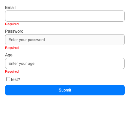
};Here’s an example of a quick and clean sign-up form where all concerns are properly separated:
1. Field Definition
Here, you’re defining the form fields along with their validation rules using Zod. The .describe() method is used to provide metadata for each field, which will later help in rendering appropriate form fields (e.g., TextField, NumberField, CheckboxField).
const SignUpFormSchema = z.object({
  email: z.string().email("Enter a real email please.").describe("Email"), // renders TextField
  password: z.string().describe("Password // Enter your password"),
  age: z.number().int().positive().describe("Age // Enter your age"), // renders NumberField
  testBoolean: z.boolean().optional().describe("test?"), // renders CheckBoxField
});
2. Field Population
In this step, you provide the properties for your fields. This includes any specific settings like enabling/disabling the field, providing dropdown options, or other field-specific properties. The beauty of this approach is that it’s type-safe and leverages IntelliSense to ensure correctness and reduce errors.
props={{
        email: {
          className: "class-to-pass",
        },
        password: {
          type: "password",
        },
      }}
3. Field Placing
In this step, you render the fields according to the design requirements. This is where the fields are arranged within the form layout, based on their intended positions in the UI.
{(fields) => <>{Object.values(fields)}</>}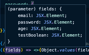
If the fields parameter provides all the fields as JSX elements, you can fully control the layout and design of your form. You can arrange the fields in any way that suits your design requirements.
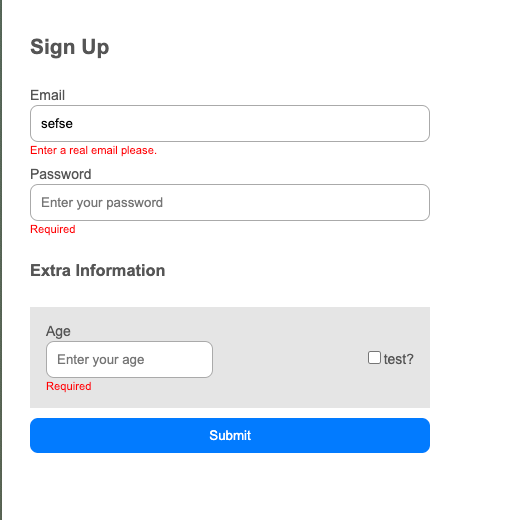
Let’s playground with design
{(fields) => (
        <>
          <h2>Sign Up</h2>
          <div>{fields.email}</div>
          <div>{fields.password}</div>
          <h3>Extra Information</h3>
          <div
            style={{
              display: "flex",
              gap: "1rem",
              alignItems: "center",
              justifyContent: "space-between",
              background: "#e5e5e5",
              padding: "1rem",
            }}
          >
            <div>{fields.age}</div>
            <div>{fields.testBoolean}</div>
          </div>
        </>
      )}
That’s one of the major advantages of this approach! Since the fields are provided as ready-to-use JSX elements, you can easily arrange them in your design without worrying about moving large blocks of code with complex props. You simply place them where needed, assign their classes or styles, and you’re good to go.
Here’s an example of how you might quickly create a “terrible” design for your form in under a minute:
Let’s create a New Pet Form for your Pet API. Using a simple request, we can quickly add a new pet.
{
  "name": "test",
  "status": "available"
}
Create the form schema
const CreatePetSchema = z.object({
  name: z.string().describe("Pet Name // Karabaş"),
  status: z.string().describe("Status // available"),
});
That’s it.
Here is the full of the form code
// src/features/pet/components/CreatePetForm.tsx

import SchemaForm from "@/infrastructure/SchemaForm";
import { z } from "zod";

const CreatePetSchema = z.object({
  name: z.string().describe("Pet Name // Karabaş"),
  status: z.string().describe("Status // available"),
});

export const CreatePetForm = () => {
  function onSubmit(data: z.infer<typeof CreatePetSchema>) {
    console.log({ data });
  }

  return (
    <SchemaForm
      schema={CreatePetSchema}
      onSubmit={onSubmit}
      renderAfter={() => <button type="submit">Submit</button>}
      props={{}}
    />
  );
};
Goes into the pet.page
import React from "react";

import PetList from "@/features/pet/components/PetList/PetList";
import { CreatePetForm } from "./components/CreatePetForm";

const PetPage: React.FC = () => (
  <>
    <CreatePetForm />
    <PetList />
  </>
);

export default PetPage;
and it looks like this
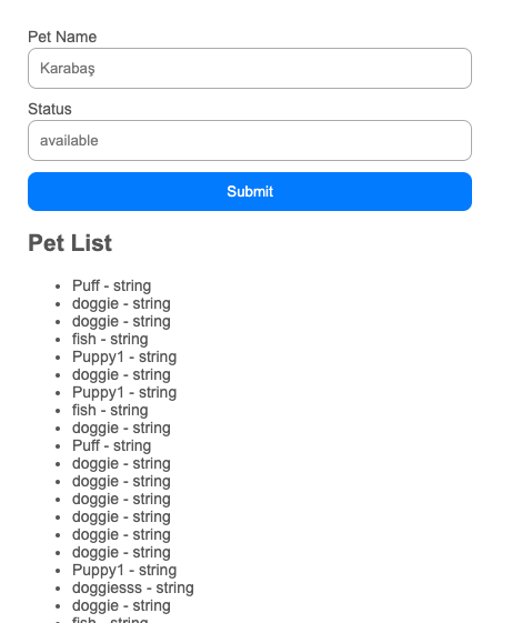
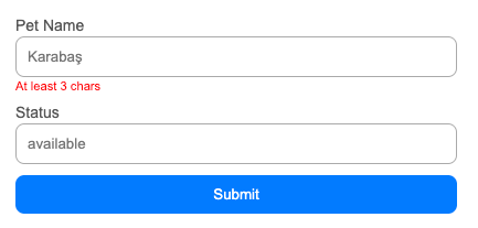
I can add additional validations very easily
Now we need to post the form values very easily. We have our query
import { useMutation } from "@tanstack/react-query";
import { Pet, petApi } from "../../../api";

export const useAddPetMutation = () => {
  return useMutation({
    mutationFn: (pet: Pet) => petApi.addPet(pet),
    onSuccess: (result) => {
      console.log({ result });
      alert("Pet added successfully");
    },
    onError: (error) => {
      alert(`Error adding pet: ${error}`);
      console.log({ error });
    },
  });
};
And using in the form
// src/features/pet/components/CreatePetForm.tsx

import SchemaForm from "@/infrastructure/SchemaForm";
import { z } from "zod";
import { useAddPetMutation } from "../api";
import { Pet } from "@/api";

const CreatePetSchema = z.object({
  name: z.string().min(3, "At least 3 chars").describe("Pet Name // Karabaş"),
  status: z.string().describe("Status // available"),
});

export const CreatePetForm = () => {
  => const { mutate: createNewPet } = useAddPetMutation(); <=

  function onSubmit(data: z.infer<typeof CreatePetSchema>) {
   => createNewPet(data as Pet); <=
  }

  return (
    <SchemaForm
      schema={CreatePetSchema}
      onSubmit={onSubmit}
      renderAfter={() => <button type="submit">Submit</button>}
      props={{}}
    />
  );
};
Conclusion
Everything is working beautifully.
This has turned into a long article — almost at book level! :) But we’ve covered some very important topics: file structure, API integrations, and form design. These are the cornerstones of building maintainable and scalable React applications.
I’d be happy to write follow-up articles based on your questions and feedback. Feel free to reach out to me on Twitter: https://x.com/benmuratturkay.
You can also find the source code for the example project here: https://github.com/mrTurkay/react-sustainable-app.
Thank you for reading, and I hope this helps you build more sustainable React apps!


